[ client ]
Spotlight Travel
[ industry ]
Travel
[ services ]
- Content Strategy & Brand Positioning
- Content Pillar System & Template Library
- Social Media Content Calendar
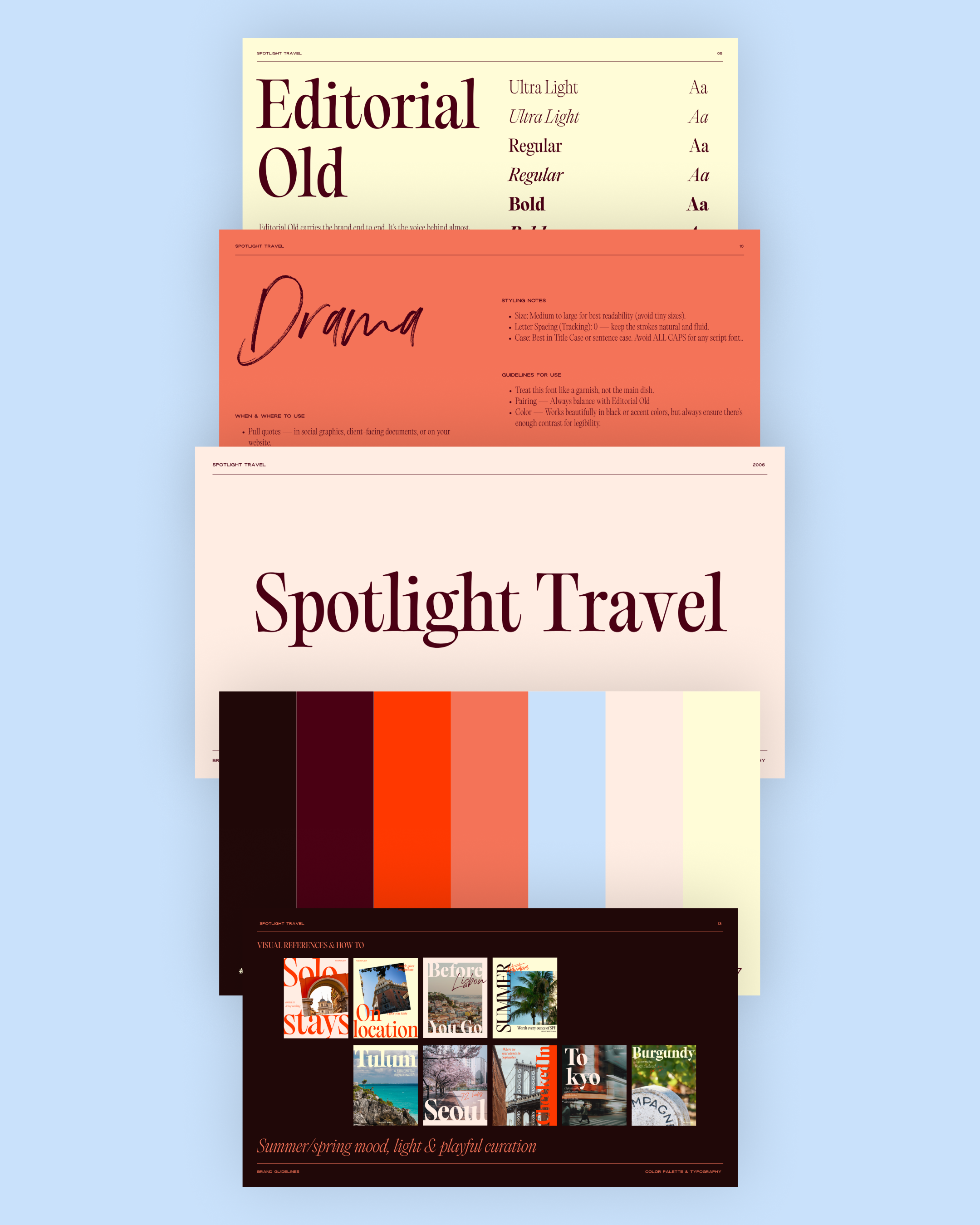
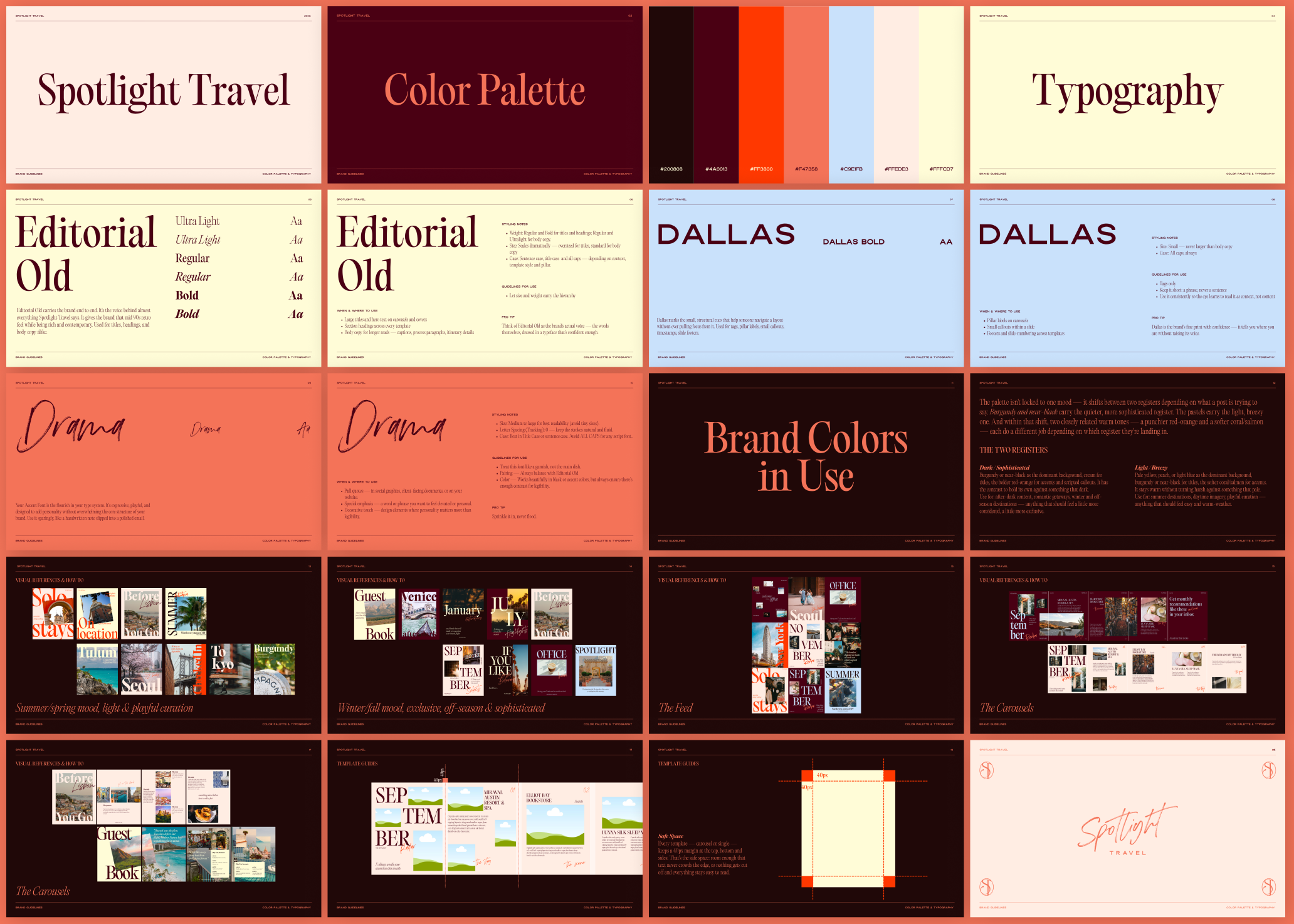
- Brand Guidelines (Typography & Color System)
- Canva Template & Carousel Design
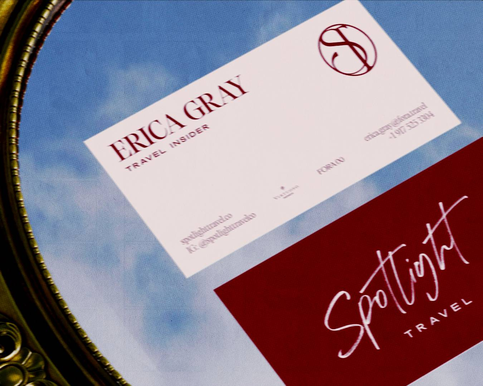
- Business Card & Client Collateral Design
[ role ]
Content Strategy, Brand Systems & Social Design
[ the brief ]
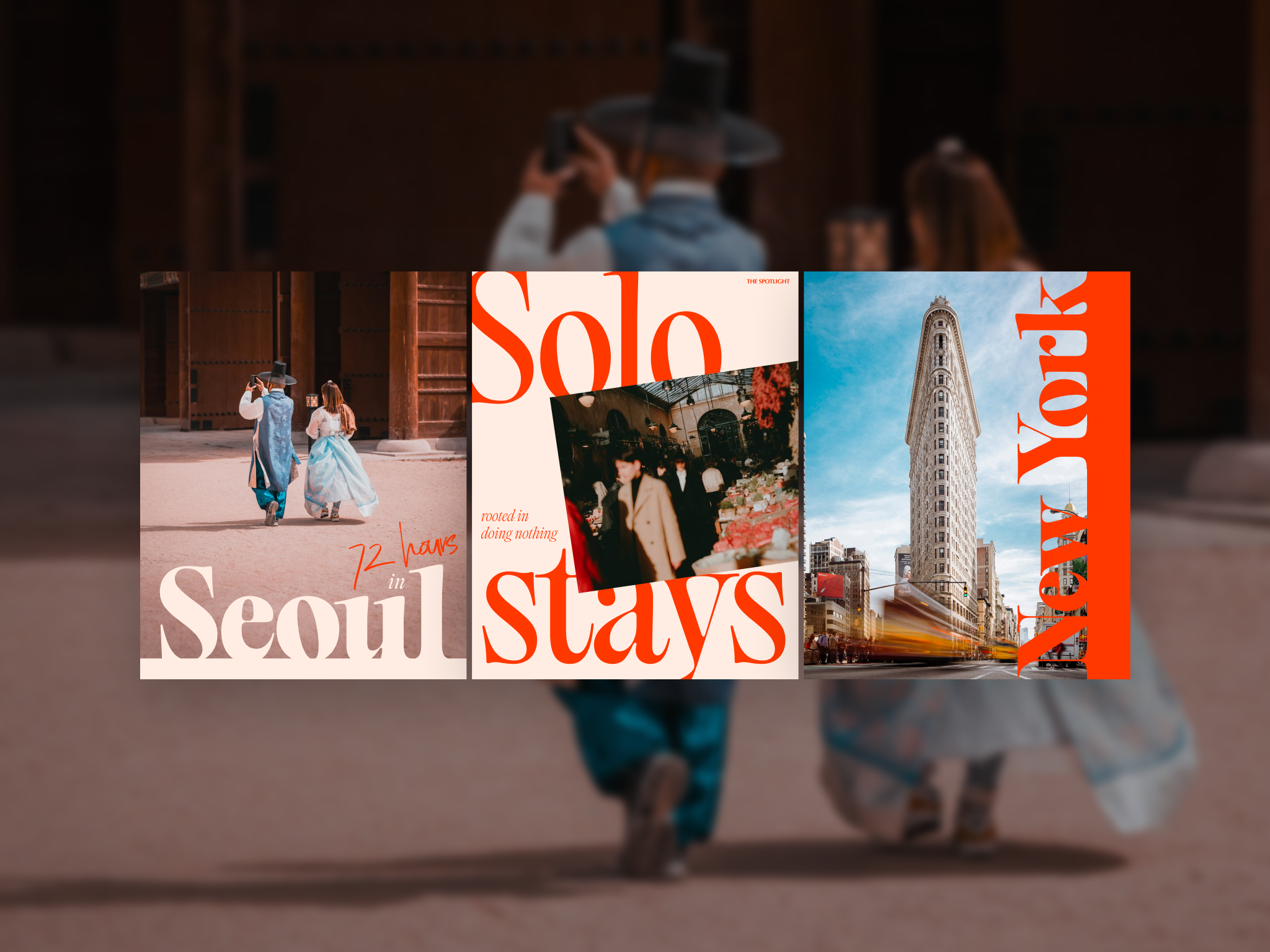
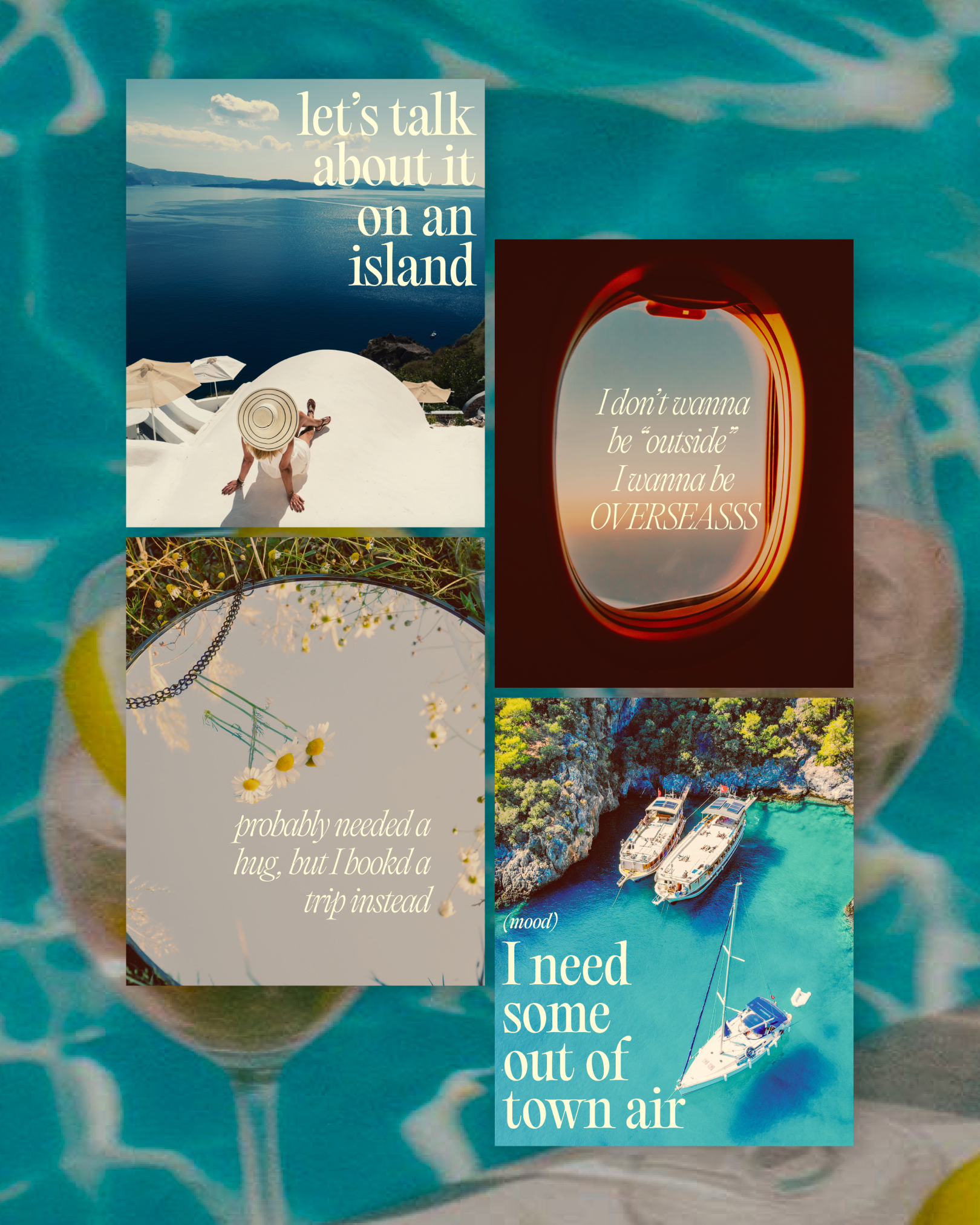
Erica Gray runs Spotlight Travel, an independent advisory in partnership with Fora and Virtuoso. She wanted to upgrade her visual identity online, as she felt her current branding was following a similar pattern to most travel advisors, and wanted a point of view and a visual style that matched how she actually works with clients: personality-first.
She had been overwhelmed and struggled to stay consistent with her posting schedule, as there was no system underneath it. Every post was a one-off decision, with no shared language for what to say, how to say it, or where a new idea should even live.
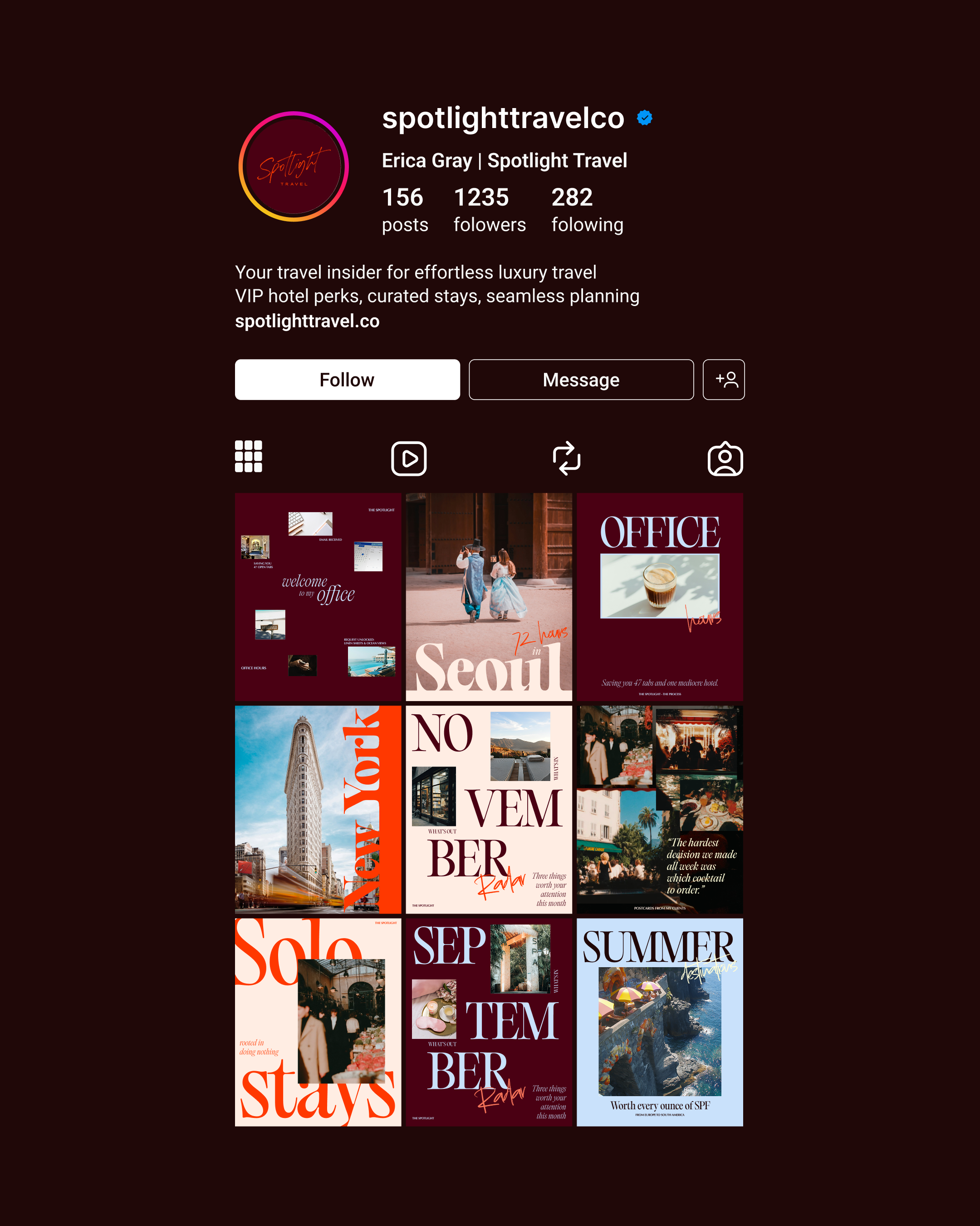
To grow in a way that felt consistent, recognizable, and hers, the content needed more than just better captions and good design. It needed a foundation — a social media template bank where, every time she pulled an idea from her content pillars, she'd know exactly which template it should go into.
[ the approach ]
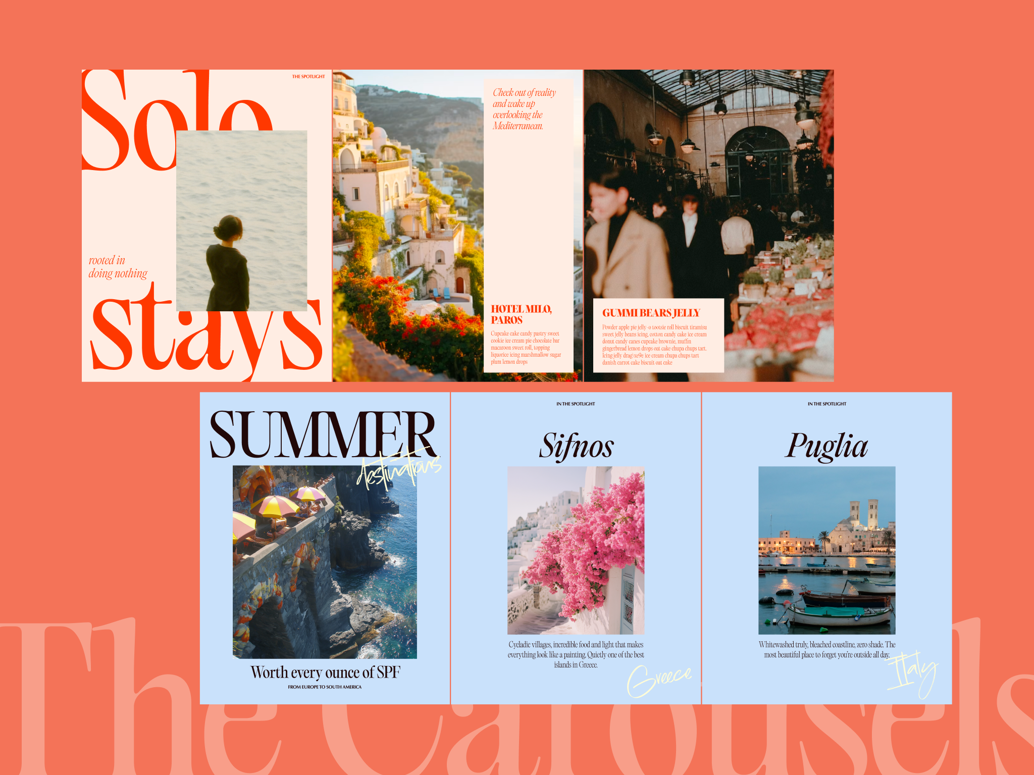
The work started with a full discovery process — positioning, differentiation, audience friction points, and what strong content looks like through Erica's eyes. From there, we built a templated library in Canva so every new idea emerging from her content pillars has a ready-made home, backed by a complete brand identity to carry it.
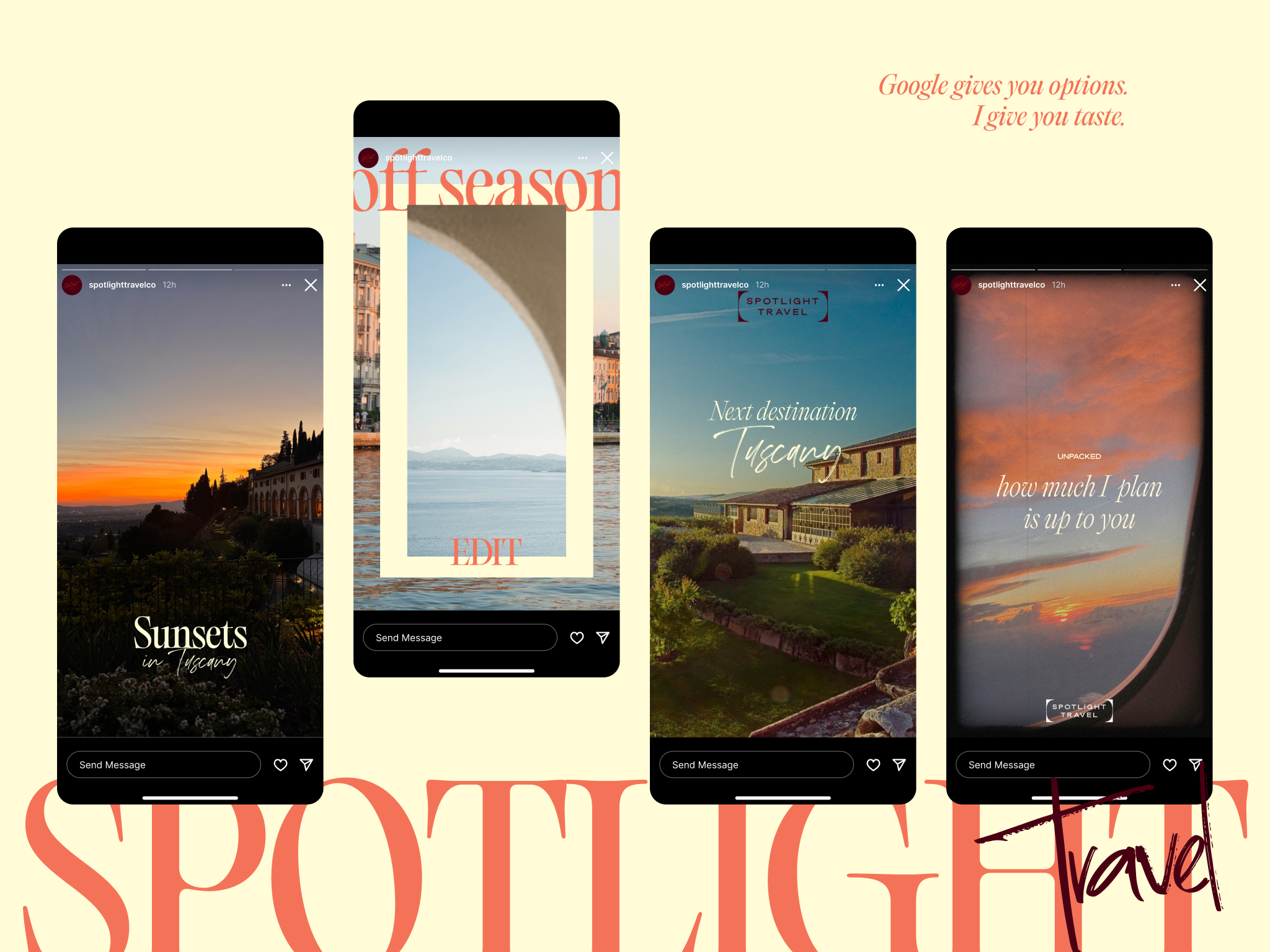
We upgraded her main font to Editorial Old, a serif that gives the brand a mid-'90s retro feel while still feeling rich and contemporary. We also extended the color palette so it shifts between two registers depending on what a post is trying to say: burgundy and near-black carry a more sophisticated register, while the pastels carry the light, breezy one. Within that shift, two closely related warm tones — a punchier red-orange and a softer coral/salmon — each does a different job depending on which register they're landing in.
That same system extended outward into carousel content, business cards, and a redesigned client service guide, so every touchpoint feels like one brand.
[ the outcome ]
Spotlight Travel now runs on an actual content system, not a blank page every week. Erica can open a template, drop in an idea, and know exactly where it goes — pillar, caption structure, visual treatment — without reinventing the format each time. The brand now carries one consistent editorial identity across captions, carousels, business cards, and client-facing materials, distinct from the generic travel content Erica set out to leave behind.